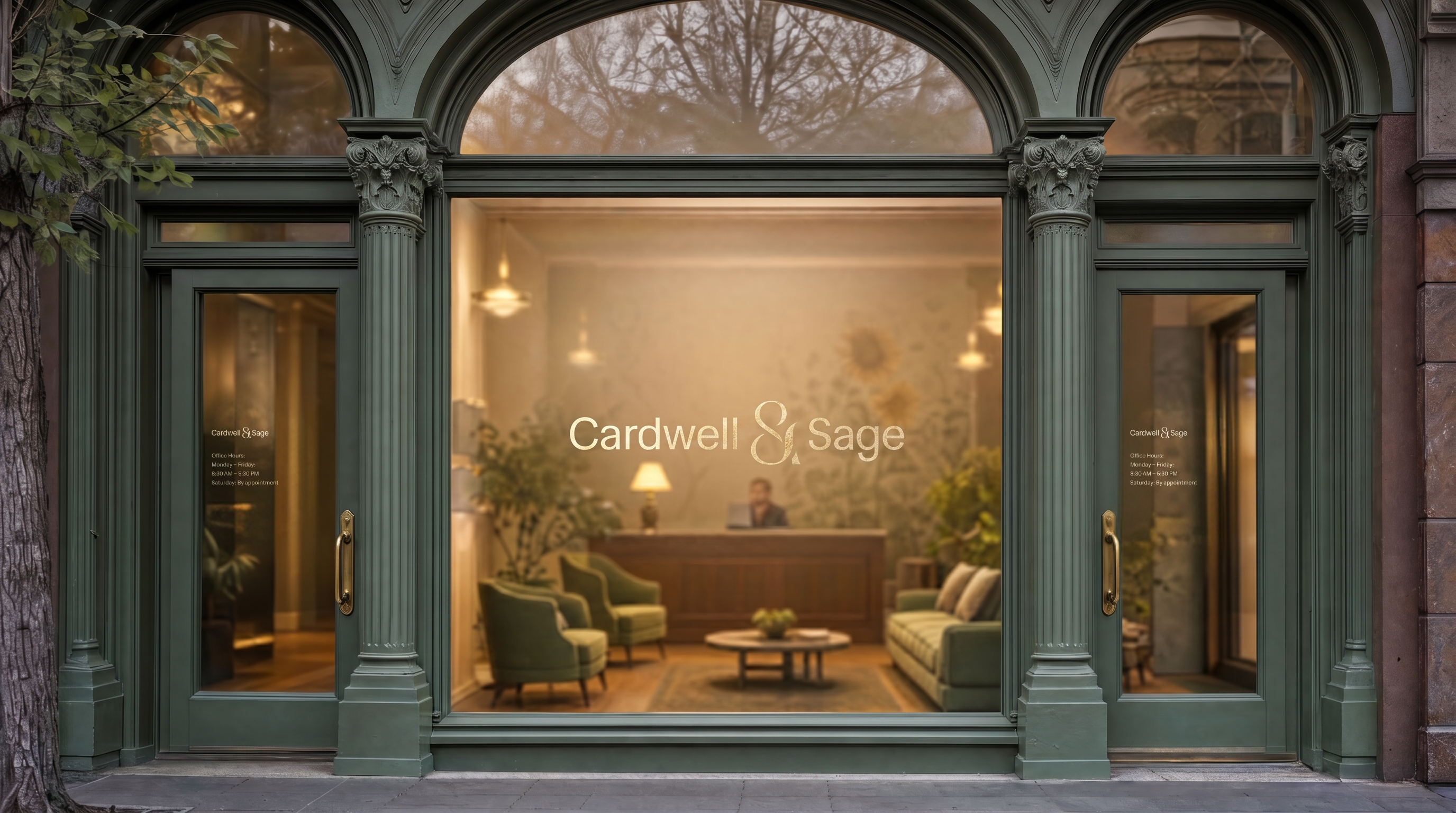
Started working with Cardwell & Sage in 2025 to build the brand identity for an Oregon-based family law practice. The scope covered logotype, color system, website, business cards, signage, and outdoor print.
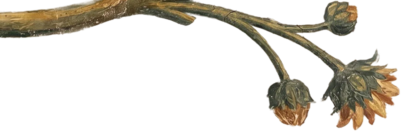
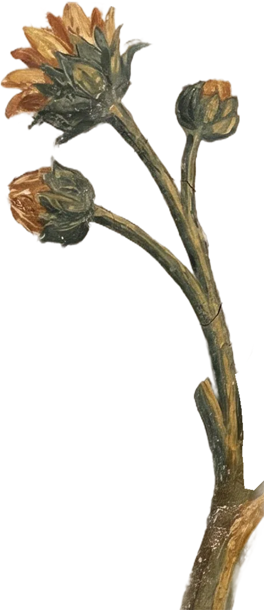
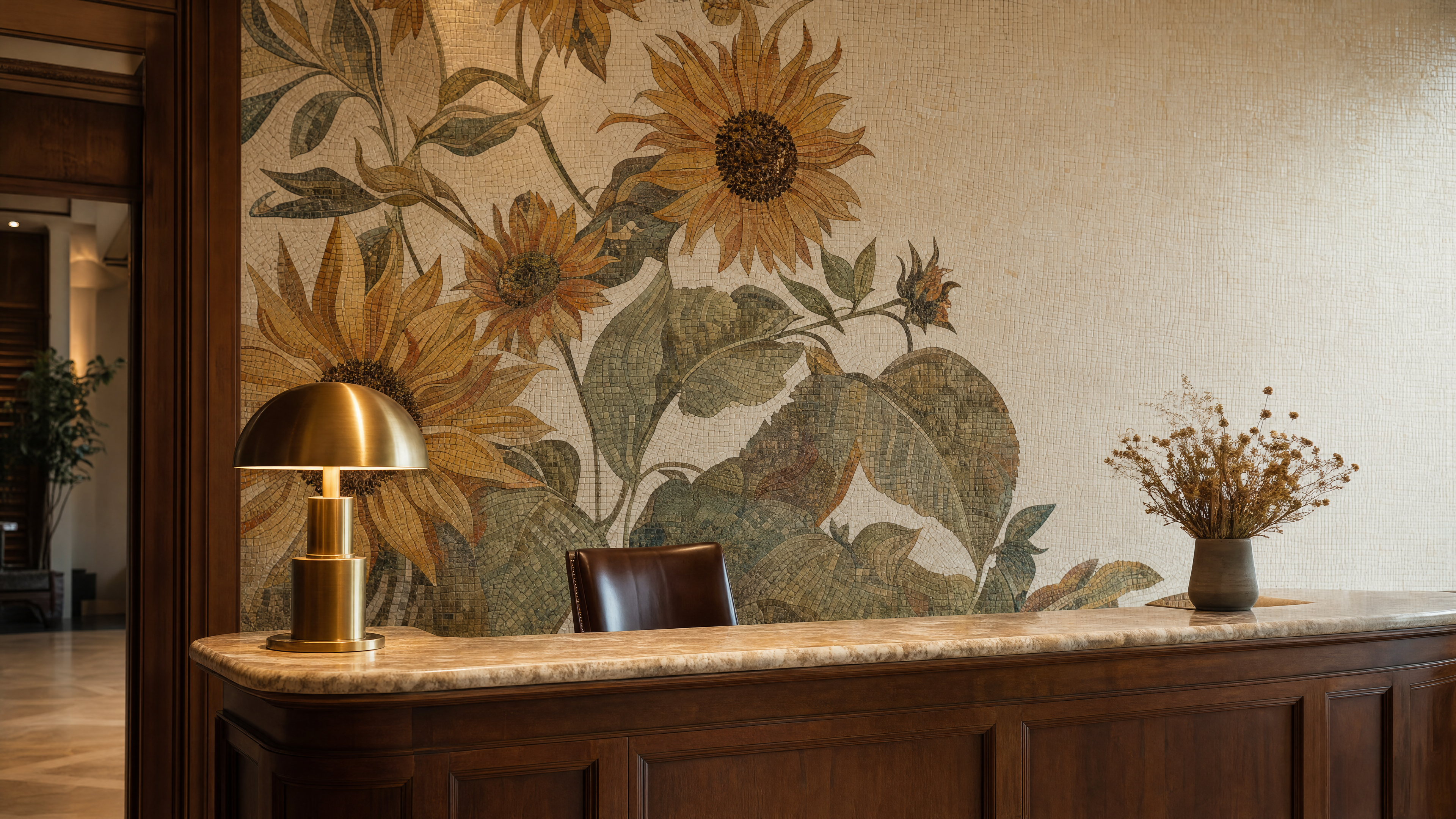
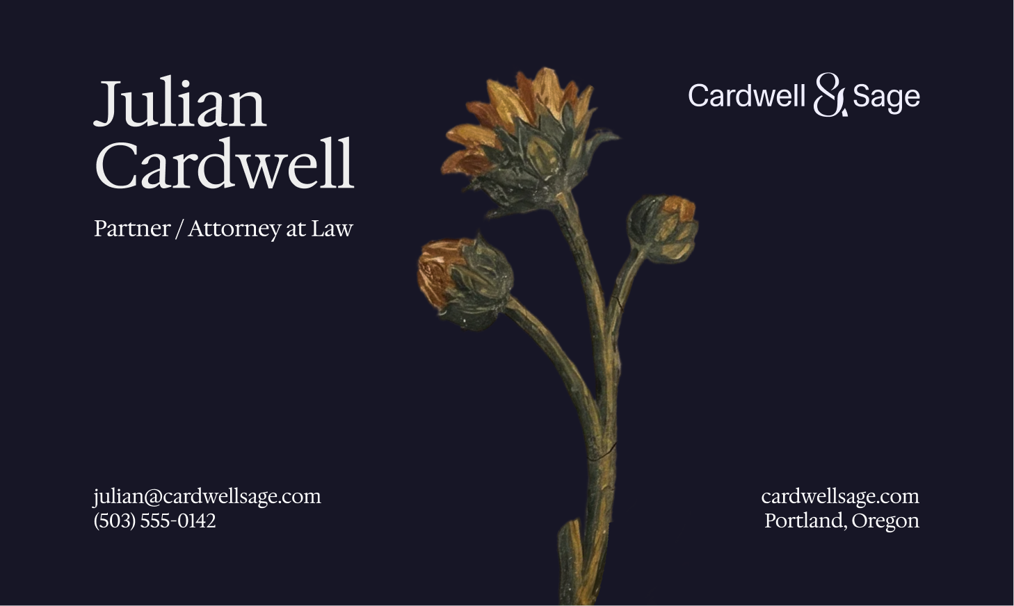
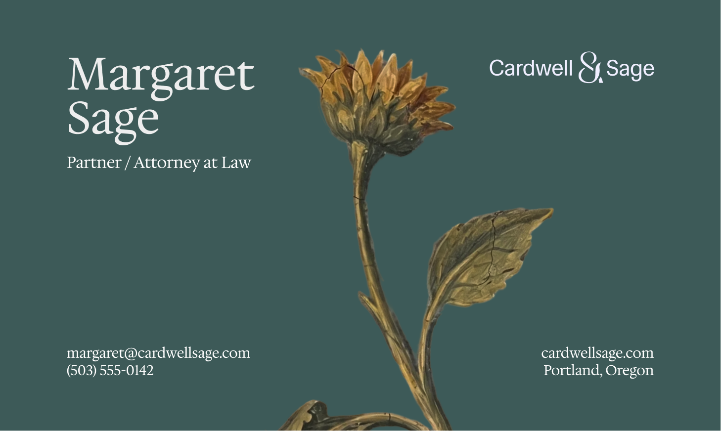
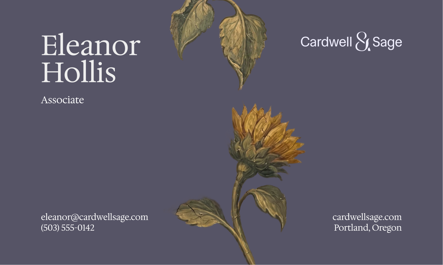
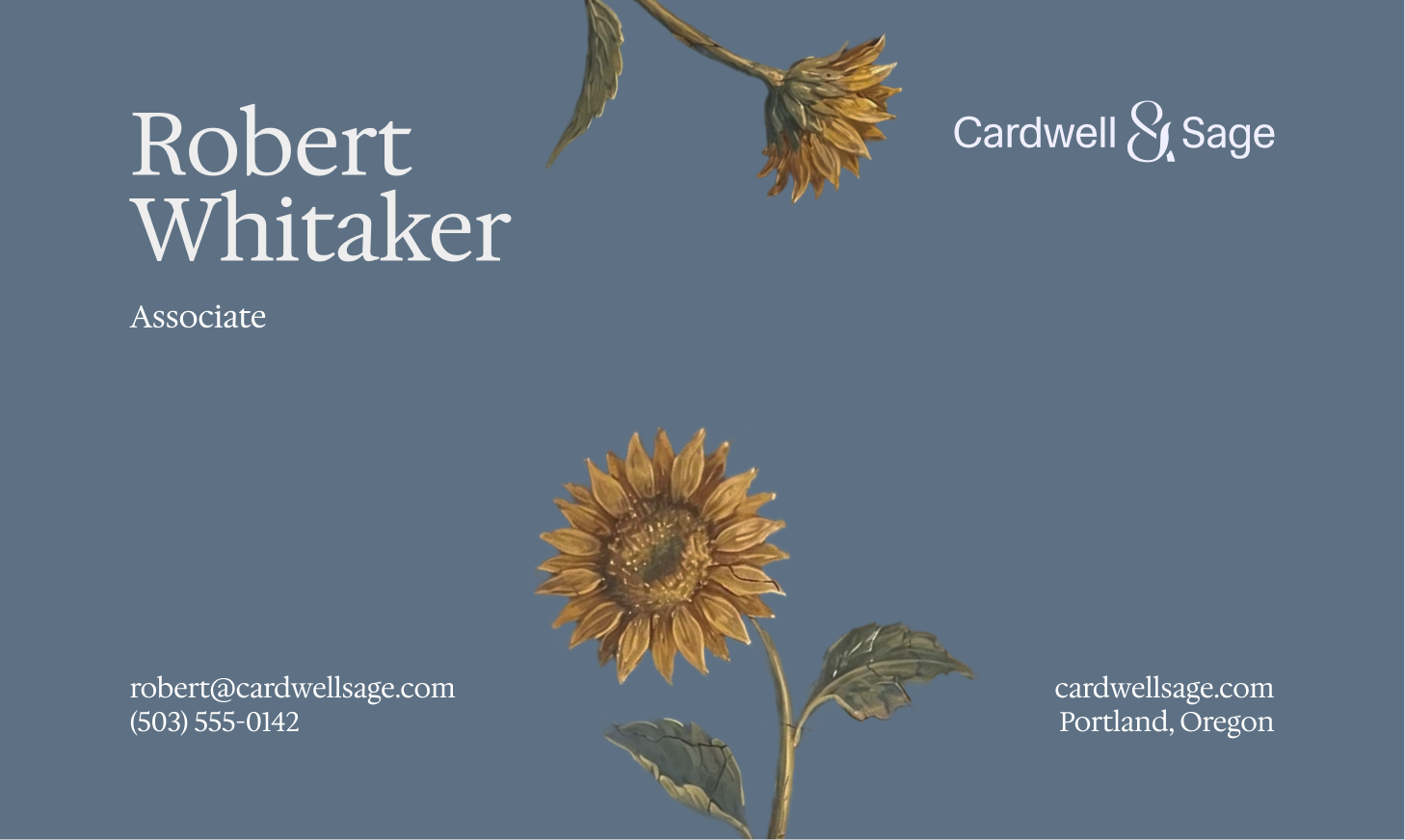
The sunflower is the quiet centerpiece of the identity. In symbolic tradition it stands for justice, loyalty, and constancy: it turns to face the sun the way law turns to face truth, and holds steady through every season. We carry it through every painted illustration as the firm's emblem.
The cracked fresco and mosaic textures speak to permanence. They reference centuries of jurists, courtrooms, and family lineages preserved in stone, positioning Cardwell & Sage not as a new firm but as the next link in a long chain of legal expertise passed across generations.
The visual language pairs hand-painted oil illustration with restrained, modern serif typography. Scales of justice and family motifs anchor each surface; the words around them stay calm and structured.
The color system runs three parallel ramps (slate, sage, lavender) so the same identity can shift mood across contexts: warm on hospitality surfaces, cool on legal pages, light on print.
The site sells trust over urgency. Visitors land on stillness, not a hard CTA. The hero illustration breathes, the headline understates, and the consultation button arrives quietly.